Agoda - Travel Agency
Fall 2026 - Extended university project
Role: UX Researcher and Designer
Team: Two Additional UX Researchers
Overview
Agoda is an online travel agency akin to Expedia or Booking.com.
This project began as a team UX research project in class that transformed into an individually led design phase.
Our goal was to identify friction and pain points in Agoda's current flight booking experience. We conducted 10 user interviews, 6 usability tests, and evaluated leading flight booking platforms. Our findings guided my redesign of the flow.
Problem
Booking friction is a significant challenge across the travel industry. Online travel agencies face extremely high abandonment rates, with roughly 8 out of 10 users leaving before completing checkout.
More than half of travelers cite poor user experience as a key reason for dropping out, highlighting the need for clear UX. This drove the question of…
How can Agoda’s flight booking flow be redesigned to reduce decision friction and help users book with confidence?
SiteMinder, Changing Traveller Report 2025 (data based on a survey of 12,000 global travelers).
Interviews
The interviews were essential in revealing what users found important and frustrating in their current flight booking rituals — regardless of whether or not they used Agoda. It was the basis I kept coming back to in my design process and grounded all of my decisions in qualitative evidence.
Through the interviews we discovered a clear focus on price and familiarity. Users often found and stuck with a booking platform. They didn't feel much need to change things up as long as it continued to satisfy.
They preferred an experience that made the process quicker and information clearer — ultimately giving them the most confidence in a high stakes environment.
Feel free to take a look at our affinity diagram of interview data.
Usability testing
We conducted 6 usability tests on the current Agoda platform. Most tasks were flight booking specific like finding the cheapest and quickest flight to a specific destination. But we also tested overall usability by having users find FAQs or cancellation policies for example.
This testing revealed areas where navigation felt unclear, how the current UI held up, and what users thought about when moving through flight booking.
Observing real behavior also helped reset any held assumptions and refocus the design on first-time clarity. These insights were invaluable to pair with what we learned from our initial interviews.
Competitive analysis
Finally, competitive analysis was a quick and low cost way to elevate my designs. Our interviewees relied on familiar platforms to complete their booking needs, so considering the design styles and user flows of leading travel agencies was a great way to create consistency and recognition within what Agoda has to offer.
What other platforms did better…

✓ Surface booking-critical details early (price, baggage, restrictions)
✓ Use clear visual hierarchy to guide comparison
✓ Maintain strong orientation and system feedback
✓ Enable easy side-by-side comparability between options
However, finding that balance between industry standards and staying true to what Agoda has established was a challenge throughout my iterating. With platform trust being built up over time, it was important to make changes that made sense beyond (subjectively) better UI.
Key findings + design beginnings
All of our research led us to 3 key findings that were actionable enough to drive the design process.
Weak intent signaling caused navigation issues and hesitation
Filters and date controls made comparison difficult
Dense layouts and inconsistent hierarchy increased cognitive load
As this project was focused on the flight booking process, I chose to redesign the 3 main points of looking at flights: arrival on the website, searching for a flight, and seeing search results.
The process stayed consistent throughout my designing where I would evaluate the current Agoda page, decide what areas I needed to focus on based on the research my team and I did, and finally iterate on designs until satisfied functionally and aesthetically.
Let's now take a quick look at the current pages and why I created the redesigns.
Landing page
This is what the landing page currently looks like.
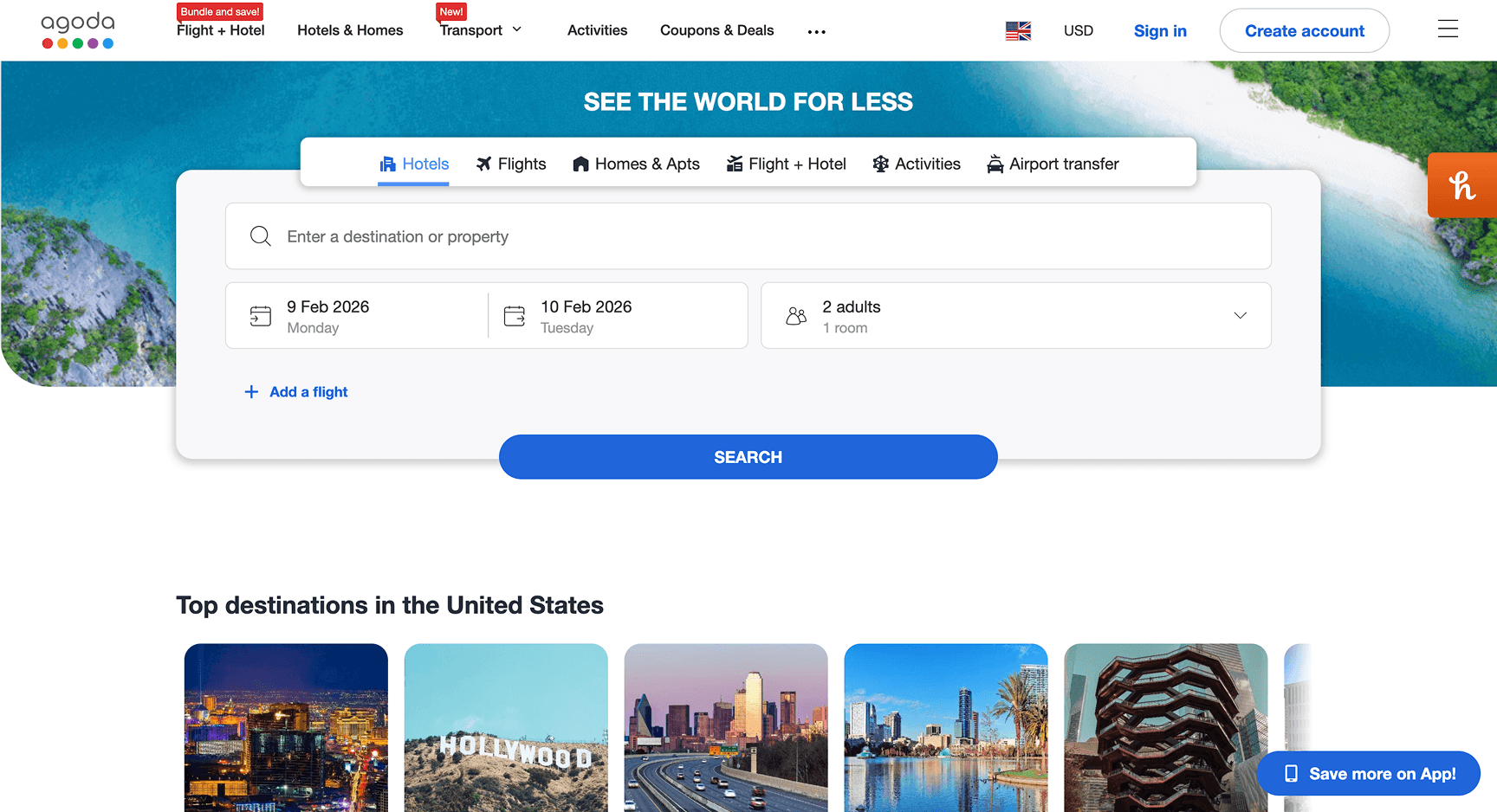
When looking at the current page, the layout needed to be simplified and visual hierarchy strengthened. This would reduce clutter, improve scannability, and keep users focused on primary actions.
Our usability testing showed that users often entered the wrong booking flow due to unclear active states. To address this, I wanted to introduce a prompting screen that clarifies user intent before search begins.
The perceived tradeoff appears large as users are met by a new screen to orient them immediately, but I realized that unless the user came to the site for hotels (as that is where Agoda initially puts everyone) it's still only a singular click.
I weighed the improved system feedback and user navigation to be much more beneficial than users searching for hotels being slowed by one click.
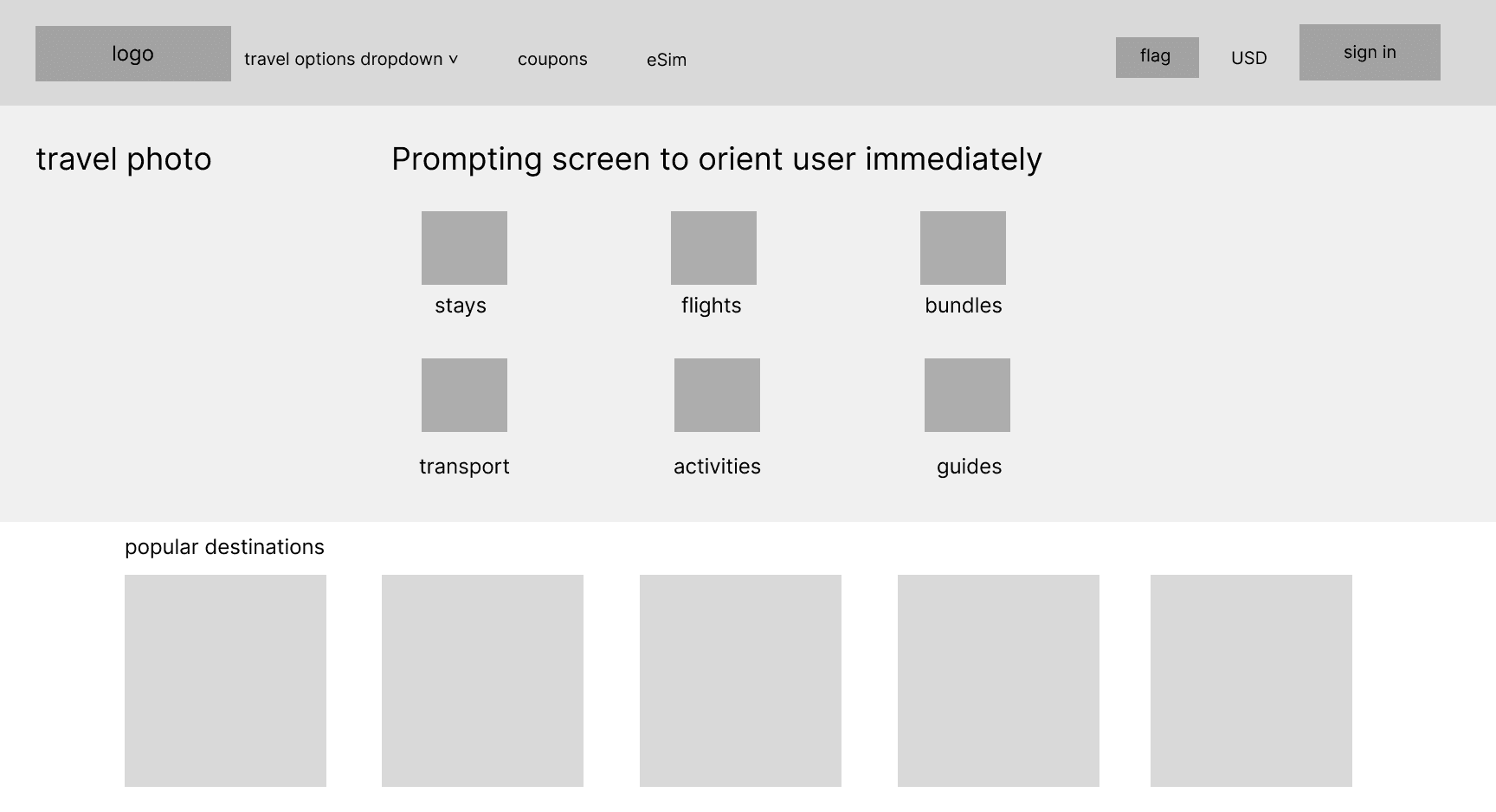
My initial attempt made travel options more visible but not as scannable as desired. Weak hierarchy made choices feel cluttered and this more creative approach strayed too far away from industry standard and the concept of familiarity that I was trying to take advantage of.
My final design ended up looking like this.
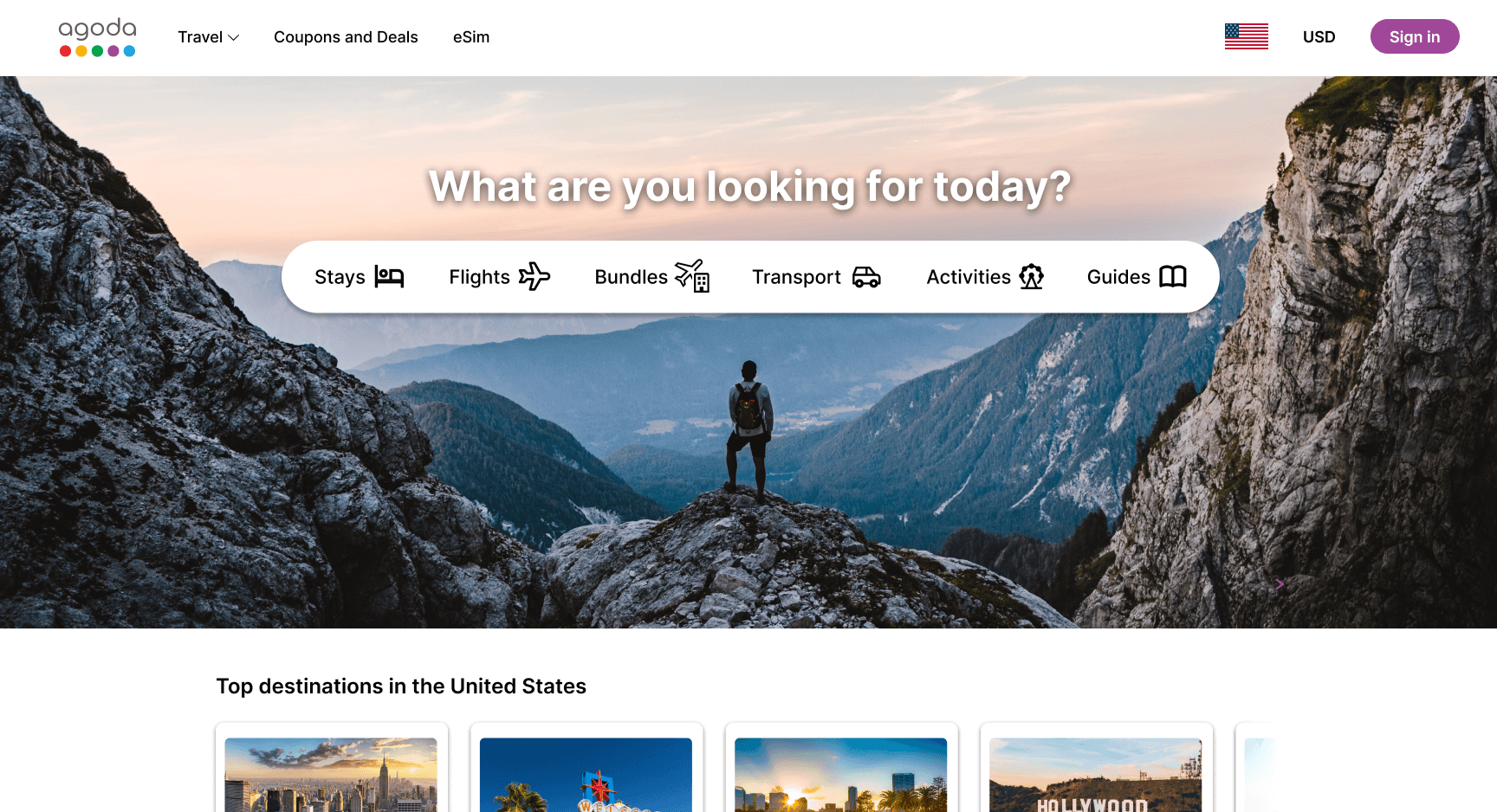
Options are easy to scan at a glance, lightweight layout reduces visual noise, page design orients users into the right flow without interrupting momentum, and it aligns better with industry standards.
Flight searching
Here is what searching for a flight currently looks like.
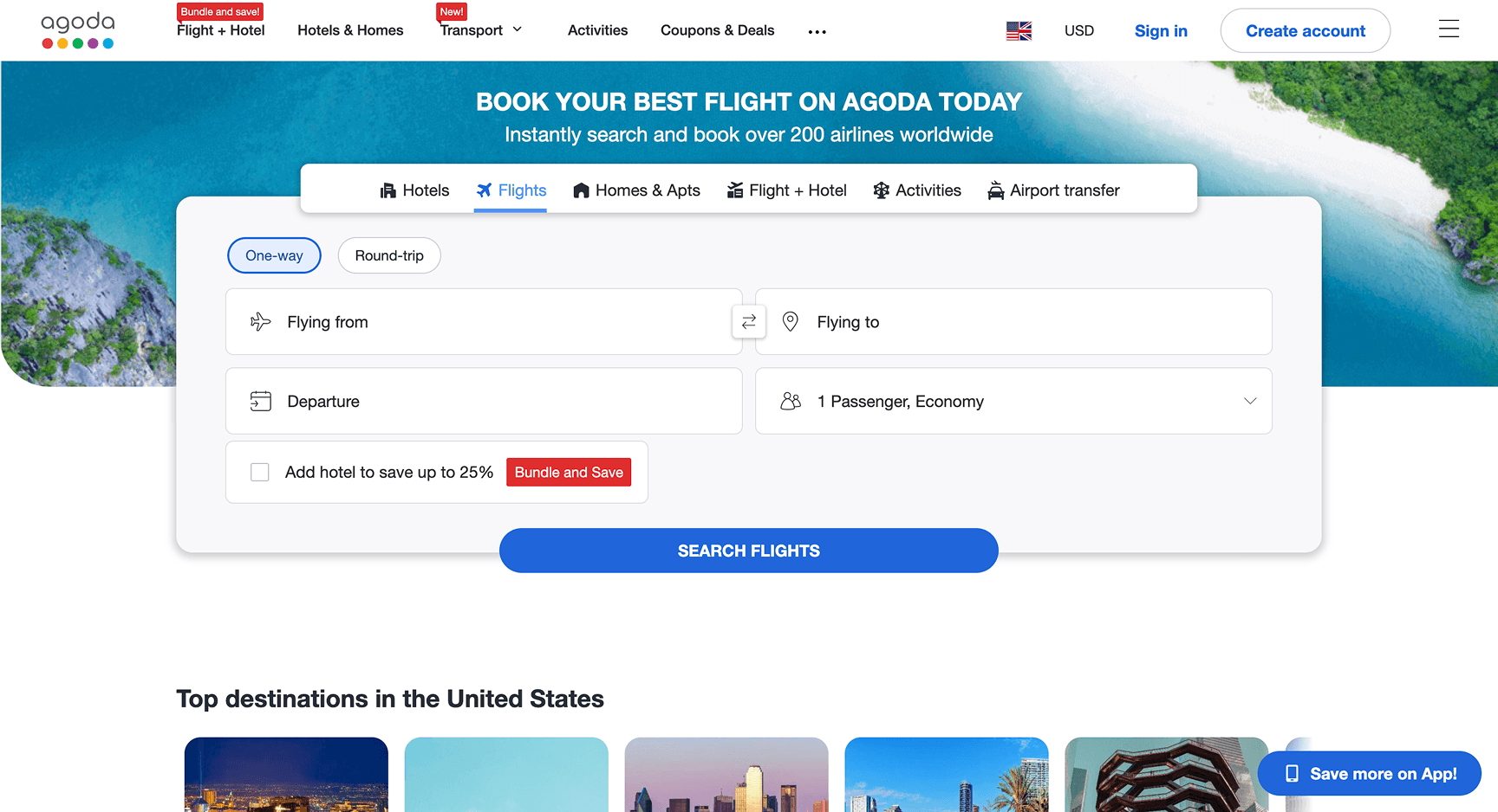
The navigation bar is cluttered, there's a lack of searching shortcuts, unnecessarily large searching box, and competing colors.
Competitor analysis highlighted the value of search history and quick re-entry points. To align with this pattern, I wanted to introduce “resume where you left off” cards that let users return to recent itineraries with one click.
The flight search was to be consolidated into a single, unified search bar, replacing stacked inputs that created clutter. Key controls needed to be emphasized through clearer hierarchy and contrast, while low-value alerts needed removing to keep users focused on completing a search.
Here's where I started.
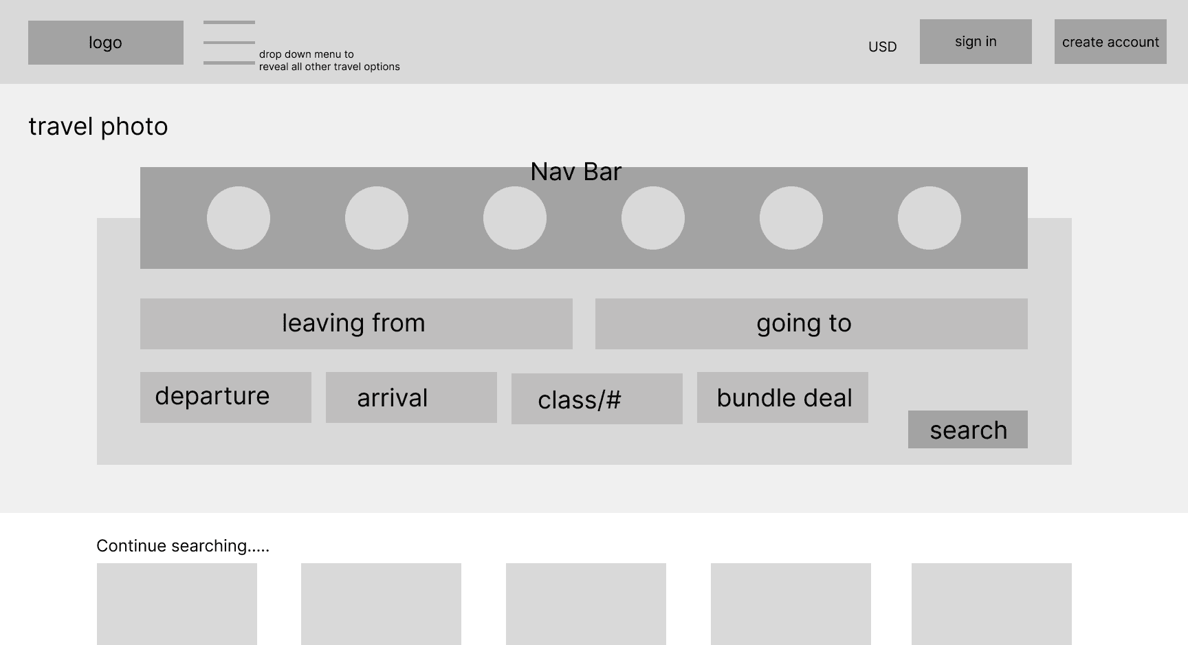
This version made navigation and inputs compete for attention, weakening hierarchy. Key actions like “resume search” are not visible enough upfront and the layout prioritizes completeness over quick understanding.
This helped inform the final design.
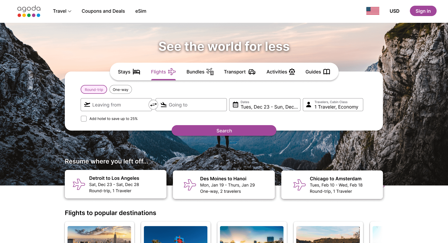
This version creates a clear hierarchy around core booking actions, it unifies inputs into a single search bar to reduce friction, surfaces resume searches immediately for faster re-entry, and de-emphasizes secondary options to limit distraction and noise.
The "Resume where you left off…" options gave power to frequent users, the unified search bar aligned better with industry standards and read more naturally left to right, spacing was tightened for the layout to feel more complete.
Flight results
Here is what the flight results screen currently looks like…
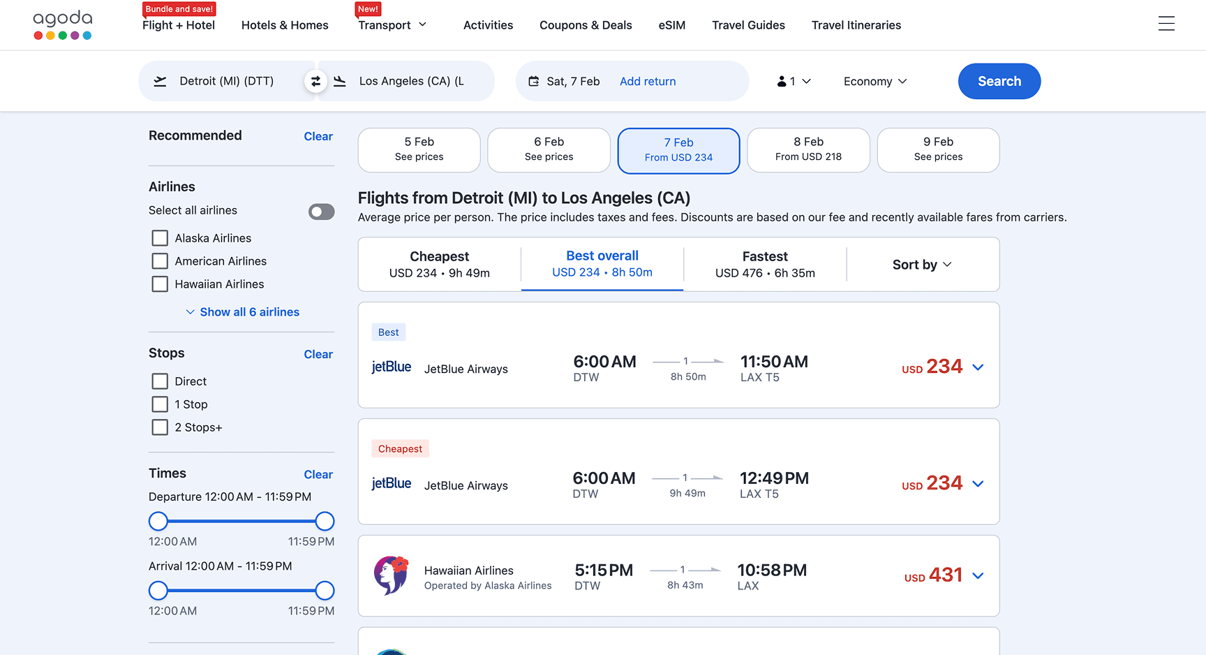
Usability testing revealed that users struggled to compare prices across dates due to weak contrast, unclear controls, and poor visual hierarchy.
To address this, I wanted to surface key filters in a high-contrast search bar, simplify the color palette, and remove distracting alerts. I also wanted to replace ambiguous indicators with with explicit dates, and make flight options easier to scan and compare at a glance.
Here is how I started my approach.
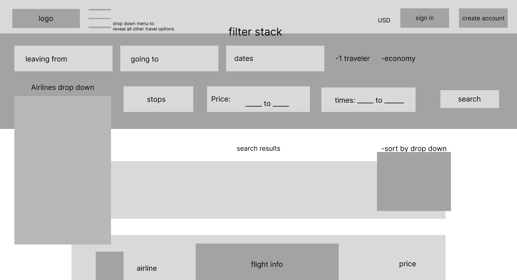
The full filter stack overwhelmed the page and buried results, excess dropdowns slowed comparison and increased friction, filters competed with, rather than supported, result scanning, and navigation lacked clear orientation or an easy way back.
For those reasons I pivoted towards this in the final version.
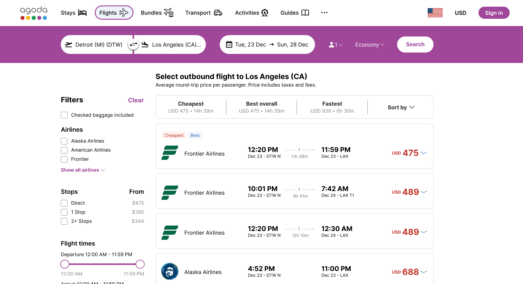
This consolidated key filters into a high-contrast bar, de-emphasized secondary controls using familiar patterns, clarified navigation to keep users oriented, prioritized results over controls, and improved scanability through a cleaner layout.
And here's a quick look at what the interaction looks like together.
Reflections
This project taught me that stronger design decisions come from layering research methods. Interviews, comparative analysis, affinity mapping, and usability testing each revealed different insights, and synthesizing them helped turn scattered findings into clearer priorities.
I also learned how much familiarity can shape design assumptions. Testing Agoda with new users exposed patterns I had taken for granted, reinforcing the importance of designing for first-time clarity.
Moving forward, I would broaden the research audience beyond college-aged international students, compare Agoda against other travel platforms, and test the redesigned flow with a fully fleshed-out prototype to validate the changes.
Ultimately, I learned that clarity is not always about showing less, but about using hierarchy to surface the right information at the right moment.
Next Project (Recharge)
↓